
Quick Answer
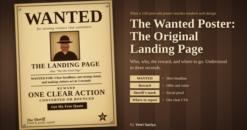
A landing page is a single page built for one goal: to make a visitor take one action. The old Wild West wanted poster does exactly this. In about three seconds, a stranger walking past understands who is wanted, why, what the reward is, and where to go. Every modern landing page should pass the same test.
Why I Am Writing This
I am currently learning landing page mastery. While reading, I kept seeing one example: the wanted poster. At first it sounded like a joke. Then I looked at one properly, and I realized it has almost everything a high-converting landing page needs.
This article breaks down a wanted poster piece by piece. Then I compare each piece to what a landing page does today. If you build websites for clients, run a business, or write copy, this is a simple mental model you can reuse.
What Is a Landing Page, Really?
A landing page is a standalone page where a visitor “lands” after clicking an ad, a link, a search result or a social post. Unlike a homepage, it does not try to show everything. It has one job and one main call to action (CTA).
A homepage is like a shopping mall. A landing page is like a signboard that says “Turn left for free tea.” One message. One direction.
The Wanted Poster: Anatomy of a Perfect Landing Page
Imagine a poster nailed to a wooden wall in a busy town square. People are walking fast. Nobody will stop to read a paragraph. Yet the poster works. Here is why.
1. The Headline: “WANTED”
The biggest word on the poster is also the most important. It tells you instantly what this page is about. You do not need to read anything else to understand the purpose.
Landing page lesson: Your headline must say what the page is about in under five seconds. Big, bold, clear. No clever puzzles. Clarity beats creativity.
2. The Hero Image: The Face
Below the headline sits a large portrait. The eye goes straight to it. It makes the message human and real.
Landing page lesson: Your hero section needs one strong visual. It can be a product photo, a real person, or a screenshot. It should support the headline, not decorate the page. Avoid random stock photos.
3. The Name: Identity and Brand
Every poster has a name, often with a nickname. It makes the subject memorable and unique.
Landing page lesson: Your brand name or offer name should be easy to see and remember. Visitors should know whose page they are on without hunting for it.
4. The Reason: “For Robbery, Cattle Theft…”
A short line explains why this person is wanted. It is the problem statement. It is brief, and it is specific.
Landing page lesson: State the problem you solve, or the benefit you give, in one or two lines. Visitors should feel “this is about me” or “this solves my issue.”
5. The Reward: The Offer
The reward amount is printed in large numbers. It is the single biggest reason to act. It is clear, concrete and impossible to miss.
Landing page lesson: This is your value proposition and offer. Say exactly what the visitor gets. Specific beats vague. “Get a 5-page website in 7 days” is stronger than “Great web solutions.”
6. “Dead or Alive”: Clear Rules
The poster leaves no doubt about what is acceptable. It removes confusion.
Landing page lesson: Remove doubt. Explain the process in simple steps, and state key terms like price, timeline and what happens next. Confused visitors leave.
7. The Authority Mark: Sheriff’s Signature
The poster is signed or stamped by the sheriff or a law office. This tells you it is official and trustworthy. Without it, anyone could claim a reward.
Landing page lesson: This is your social proof and trust layer: testimonials, client logos, reviews, certifications, security badges, case studies, and a real name and face behind the business.
8. Where to Go: The Call to Action
The poster tells you where to report. In a real poster, this is usually the sheriff’s office or a named person. It is one place and one action.
Landing page lesson: One primary CTA. Use a clear action label such as “Get My Free Quote” instead of “Submit.” Repeat the same CTA at the top, middle and bottom of a long page. Do not offer five different buttons.
9. Urgency: “Last Seen…” and Time Limits
Many posters hint at recent activity or a deadline. It creates a feeling that acting now matters.
Landing page lesson: Use honest urgency: limited slots, a real deadline, or a seasonal offer. Fake countdown timers hurt trust. Real scarcity helps.
10. Visual Style: Bold Type and High Contrast
A wanted poster uses heavy serif letters, dark ink on light, aged paper and a clear border. It looks like what it is. The design matches the message.
Landing page lesson: Pick a visual style that fits your audience. Keep strong contrast, a clear type hierarchy, and plenty of white space. Design is not decoration. It guides the eye.
11. One Page, One Goal: No Distractions
The poster does not have a menu, a shop, an “About Us” section, or ten side stories. It has one purpose.
Landing page lesson: Remove the main navigation menu where possible. Remove links that pull people away. Every element on the page should support the one action.
12. Right Place, Right Audience
Posters were placed in saloons, post offices and town squares, where the right people would see them. The placement mattered as much as the content.
Landing page lesson: Match your page to the traffic source. If your ad says “Free WordPress audit,” the landing page headline should say the same. This is called message match.
Wanted Poster vs Modern Landing Page: Side by Side
| Wanted Poster Element | Modern Landing Page Equivalent | Purpose |
|---|---|---|
| WANTED headline | Hero headline | Say what this is in 3 seconds |
| Portrait | Hero image or video | Grab attention, show the real thing |
| Name and nickname | Brand or offer name | Be memorable |
| Crimes listed | Problem and benefits | Explain why it matters |
| Reward amount | Value proposition, pricing | Give a reason to act |
| Dead or Alive | Terms, process, FAQs | Remove confusion |
| Sheriff’s signature | Testimonials, logos, reviews | Build trust |
| Where to report | CTA button and form | Drive one action |
| Last seen / deadline | Honest urgency | Encourage action now |
| Bold type, border | Visual hierarchy, contrast | Guide the eye |
| Single purpose | No navigation, one goal | Avoid distraction |
How Landing Pages Have Evolved
The wanted poster has the right ideas, but today’s landing pages have much more to work with.
1. Mobile first. Most visitors arrive on a phone. A modern page must read well on a small screen, with thumb-friendly buttons and short blocks of text.
2. Speed. A poster loads instantly. A web page must too. Slow pages lose visitors before they read a word. Pay attention to Core Web Vitals: loading speed (LCP), responsiveness (INP) and layout stability (CLS).
3. Personalization. A poster is the same for everyone. A modern page can change its headline based on the ad, the location or the visitor type.
4. Interactivity and proof. Forms, calculators, short videos, live chat and real-time reviews can answer questions the poster never could.
5. Measurement. A poster cannot tell you how many people looked at it. A landing page can. With analytics, heatmaps and A/B testing, you can improve it every week.
6. Trust and privacy. Visitors now care about data. Clear privacy notes, secure forms and honest claims matter more than ever.
7. Accessibility. A good page works for everyone: readable contrast, alt text, keyboard navigation and clear labels. It is also good for SEO.
8. Search and AI answers. People now find pages through search engines and AI assistants. Clear structure, direct answers and well-defined entities help your page get found and quoted.
The Landing Page Checklist (Inspired by the Wanted Poster)
Use this list when you build or review any landing page:
- Can a stranger understand the purpose in 3 seconds?
- Is there one clear headline and one supporting line?
- Is there one strong hero visual?
- Is the problem or benefit stated in plain words?
- Is the offer specific and easy to find?
- Are the steps and terms clear?
- Is there real proof: testimonials, logos, results?
- Is there one primary CTA, repeated in the right places?
- Is the urgency honest?
- Does the page load fast on mobile?
- Are distractions removed?
- Does the page match the ad or link that brought the visitor here?
A Real Example for Freelancers and Small Businesses
Say you are a local photographer. A weak landing page has a big menu, a long story about your journey, 40 photos and a small “Contact” link at the bottom.
A wanted-poster-style page does this instead:
- Headline: “Wedding Photos Delivered in 7 Days”
- One hero photo of a happy couple
- Three short benefit lines
- Two or three testimonials with names
- A clear package price or starting price
- One button: “Check My Date”
Same business. Same skill. Far clearer action.
Common Mistakes to Avoid
- Trying to say everything on one page
- Vague headlines like “Welcome to our website”
- Many CTAs competing with each other
- Stock photos that say nothing
- Long forms with too many fields
- No proof or trust signals
- Ignoring mobile and speed
- Fake urgency
Final Thoughts
The wanted poster survived because it respected one rule: attention is short, so every element must earn its place. The tools have changed from ink and paper to HTML and analytics, but the rule is the same.
When you design your next landing page, imagine it nailed to a wall in a busy town square. If a stranger can understand it and act in three seconds, you have done it right.
Frequently Asked Questions
What is a landing page?
A landing page is a standalone web page designed for one goal, such as getting a sign-up, a call, a purchase or a quote. It removes distractions and guides the visitor to one clear action.
Why is a wanted poster a good landing page example?
It has a clear headline, one main image, a specific offer (the reward), a trust mark (the official signature), a single call to action and no distractions. All of these are core landing page principles.
What are the must-have elements of a landing page?
A clear headline, a supporting subheadline, a hero visual, a benefit-focused body, social proof, a single CTA, and fast mobile performance. A short FAQ and honest urgency also help.
How is a landing page different from a homepage?
A homepage introduces the whole business and has many paths. A landing page has one purpose and one path.
How long should a landing page be?
As long as it needs to answer the visitor’s questions, and no longer. A simple, low-commitment offer can work with a short page. A higher-priced or complex offer usually needs more proof and detail.
Comments